

© 2026 Saad Web Designer | All Rights Reserved


Brooklyn, NYC
Construction Company Website Design in NYC: Project Galleries, Service Areas and Estimate Requests
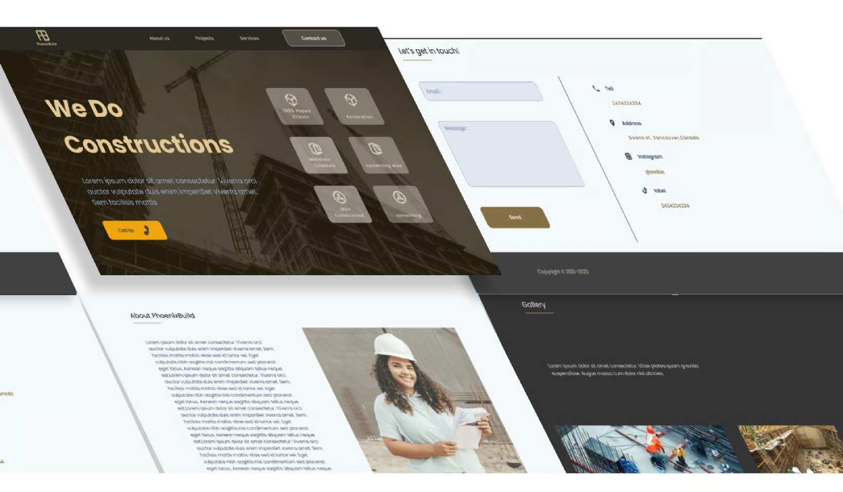
A homeowner choosing a contractor starts with the website. They want to see the work, check the areas served, and ask for an estimate. Construction website design NYC companies rely on puts those three things front and center. A site that hides the work or buries the form loses the job before the first call.
This guide covers the pages that matter for a construction company. Project galleries, before-and-after photos, service-area pages, estimate forms, and trust signals like licenses and insurance. The best construction company website features are the ones that help a homeowner decide fast. Good design earns the call.
What Homeowners Look for First
A homeowner visits a construction site with one question: can this company do my job? They scan the photos, read the services, and look for a phone number. The first screen should answer all three. A clear headline, a real project photo, and a visible call button do the work.
Keep the homepage short. Three services, three projects, and one clear next step. A homepage that tries to say everything says nothing. The visitor should reach the gallery or the estimate form in one click. Every extra click loses jobs. A gallery link and an estimate button on the homepage make the next step obvious.
Project Galleries That Win Jobs
A gallery is the strongest page on a construction site. Homeowners trust photos more than words. Show the finished work in full, with wide shots and close-ups. A contractor website developer for New York homeowners builds the gallery around real projects, with the borough, the service, and the result named on each one.
Organise the gallery by service. Kitchens, bathrooms, roofs, and extensions each get their own group. A visitor looking for a kitchen should find kitchens, not scroll past roofs. Add a short line under each photo: what was done, and how long it took. Real details beat vague claims. A gallery that is easy to browse keeps visitors on the site longer.
Before and After: Proof That Sells
Before and after photos do what words cannot. They show the change in one glance. A tired kitchen becomes a bright one. A cracked driveway becomes a smooth one. Pair each photo set with the same angle, so the difference is honest. A gallery that shows real change builds trust fast.
Ask every customer for permission to photograph the work. Most agree when they love the result. Keep the photos honest, with no heavy filters. A photo that looks too perfect raises doubts. Real work, shown plainly, wins more jobs than polished stock images ever will. A dated photo also shows the work is recent, not from years ago.
4. Navigation Patients Can Follow Without Thinking
A worried patient should never get lost on your site. Keep the menu short. Services, providers, locations, appointments, and contact cover most needs. Keep the menu in the same place on every page. When the menu changes from page to page, they lose trust, so a clear label always wins over a fancy one.
Think about the phone first. Most patients visit on a small screen. Buttons must be big enough to tap. Text must be easy to read without zooming. If you want help with the structure, a Web Designer in New York can shape the navigation around how real patients move through a site. Test it with someone who has never seen the site, watch where they pause, and fix those spots first.
Case Studies: Turn One Job Into Ten
A case study tells the story of one project. The problem, the plan, the work, and the result. Construction website design NYC companies use well turns a single kitchen into a page that brings ten more kitchen jobs. A short case study, with photos and a few honest lines, works harder than a full services page.
Keep each case study to one page. The customer's problem in two lines, the work in three, and the result in one. Add the borough and the project type, so nearby homeowners find it. A case study that names the area brings local enquiries. One good story can carry a whole service. A case study page that ranks well brings enquiries for months.
Service-Area Pages for NYC Boroughs
A contractor who works across New York needs a page per area. Manhattan, Brooklyn, Queens, the Bronx, and Staten Island each deserve their own page. Each page names the neighborhoods, the services offered there, and a recent project nearby. A homeowner in Queens wants to see Queens work, not a generic city page. A page that names local streets and landmarks feels written for that area.
Local pages help search too. A page for Brooklyn renovations shows up when a Brooklyn homeowner searches. Keep each page honest, with real projects from that area. A page with no local work is just a list of place names, and visitors can tell. Build the page only where the work exists.
Estimate Request Forms That Get Filled In
The estimate form is where the website earns its keep. Keep it short. Name, phone number, service needed, and a few words about the job. A contractor estimate request website that works asks for little and gives a clear next step. A form with ten fields scares people away.
Tell the visitor what happens next. A call within one business day, or a visit to measure the job. A short note under the form sets the expectation. Add a photo upload option, so the homeowner can show the problem. A form that feels easy gets filled in, and a filled form is a lead. A clear reply time builds trust before the first call happens.
Licenses, Insurance, and Trust
Construction is a big decision, and homeowners check the details. Show the license number, the insurance, and the years in business. A company that hides these details raises doubts. A company that shows them earns the call. Trust starts with proof, not promises. A company with nothing to hide shows these details without being asked.
Put the proof where eyes land. A license number in the footer, insurance on the about page, and a review or two on every service page. The best construction company website features are honest ones: real numbers, real reviews, and real photos. A homeowner who sees proof feels safe enough to call.
Mobile Click-to-Call: The First Contact
Most construction enquiries in New York start on a phone. A homeowner sees a problem, searches, and calls. The call button must be easy to find. A big tap-to-call button at the top, on every page, turns a visit into a conversation. A contractor website developer New York businesses work with knows the first contact is often a call, not a form.
Make the call easy. The button should work with one tap, and the number should be correct on every page. Add a WhatsApp option for homeowners who prefer to write. A missed call is a lost job, so answer fast or return the call the same day. Speed wins the job. A missed call answered within the hour still wins the job sometimes.
Conversion Principles for Construction Pages
A construction page should do one job: turn a visitor into an enquiry. Clear headline, real photos, one call to action. The page should not ask the visitor to choose between five actions. One page, one job, one button. That focus is what turns traffic into calls. A page with one clear job converts better than a page with five.
The general rules of conversion apply here too, from headlines to trust signals. For the full principles, NYC Service-business Landing Page Design covers how service pages turn visitors into leads, with local messaging, clear calls to action, and simple forms. Use those principles on the construction pages, and let the project photos do the selling.
Launch Checklist: Test Before You Publish
Never launch without a test. Open every page on a phone. Call the number on the site. Fill out the estimate form. Ask someone outside the company to try it. They will find the broken links in minutes. A site that looks good but breaks on a phone loses jobs. A broken form on launch day means lost jobs from the very start.
Check the small things too. Does the gallery load fast? Are the service-area pages correct? Do the forms reach the right inbox? If you want help with the build, a Website Developer in New York can shape the pages around how homeowners actually move through a construction site. Test everything once more after launch.
Conclusion
A construction website wins jobs with proof. Real galleries, honest case studies, clear service areas, and a short estimate form do the work. A contractor estimate request website that is easy to use brings better leads than a pretty site that hides the form. The photos and the proof sell the job.
Start with the gallery, not the colors. Add one page per area, keep the form short, and make the call button easy to find. A site that shows real work earns real calls, and real calls become real jobs.
FAQ's
How many photos should a project gallery have?
+Should I show prices on a construction website?
+Do I need a page for each borough?
+What should an estimate form ask for?
+How do I show licenses on my website?
+Does my construction website need click-to-call?
+

