


© 2026 Saad Web Designer | All Rights Reserved


Brooklyn, NYC
Medical Practice Website Design in NYC: Patient Forms, Appointment Requests and Trust Signals
A patient who finds your practice online wants three things fast: who you are, what you treat, and how to book. If any of these is hard to find, they move on to the next practice. Good medical website design NYC patients can trust starts with that simple fact. Your website is the front desk and the first phone call in one place.
Most patients search on a phone, often while worried or in pain. They do not read long pages, they scan. A strong healthcare website design New York practices rely on makes the next step obvious on every page. This guide walks through the pages, forms, and trust signals that turn a nervous visitor into a booked patient.
1. What Patients Look for First
A patient lands on your homepage with one question in mind. Can this practice help me? Answer it in the first screen. Name the practice, the specialty, and the neighborhood. A short line about who you see works well, so keep it plain. The patient should know in five seconds that they are in the right place.
Then show the next step. A clear button to request an appointment belongs at the top of every page. Next to it, put the phone number. Some patients prefer to call, others prefer a form, so give them both. A small note about new patients tells first-time visitors they are welcome and what to bring.
2. Provider and Service Pages That Answer Real Questions
Patients choose people, not logos. A provider page should feel like a real person. Use a real photo, not a stock image. Add a short bio in plain words. Where did they train, what do they treat most, and what languages do they speak? These are the doctor website features patients actually read before they book.
Service pages need the same care. Each service gets its own page. Say what the visit covers, how long it takes, and what the patient should expect. A page about a first visit calms a nervous patient, and a page about a follow-up visit saves a phone call. Keep each page short and focused on one service.
3. Appointment Requests That Feel Easy
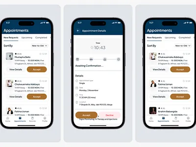
Booking should take minutes, not a phone call and a wait. A simple form asks for a name, a phone number, and a preferred time. A patient who is in pain will not fill out ten fields. Good medical website design NYC practices use keeps the first step short and the rest for later. The practice can collect the details after the request comes in.
Show what happens next. A short line under the form helps a lot. It can say the office will call within one business day to confirm. Patients feel calmer when they know the next step, so add a note for urgent needs too. A patient with an emergency should call, not wait for a form reply.
4. Navigation Patients Can Follow Without Thinking
A worried patient should never get lost on your site. Keep the menu short. Services, providers, locations, appointments, and contact cover most needs. Keep the menu in the same place on every page. When the menu changes from page to page, they lose trust, so a clear label always wins over a fancy one.
Think about the phone first. Most patients visit on a small screen. Buttons must be big enough to tap. Text must be easy to read without zooming. If you want help with the structure, a Web Designer in New York can shape the navigation around how real patients move through a site. Test it with someone who has never seen the site, watch where they pause, and fix those spots first.
5. Accessibility: Design for Every Patient
Your patients include older adults, people with low vision, and people who use a screen reader. Design for them from the start. Use text that is large enough to read. Keep the contrast strong between text and background. Headings should follow a clear order, and images need short descriptions. These small choices open the door to more patients.
Forms deserve the same care. Label every field clearly. Mark the required fields. Give an error message that says what went wrong in plain words. A patient who cannot finish a form will call, or they will leave. This is where medical practice website development gets practical. The goal is a site that every patient can use without help.
6. Forms That Respect Privacy
A medical form collects sensitive details. Ask only what the visit needs. A first request needs a name, a contact, and a reason for the visit. Keep the form short and say why each field is there. Patients share more when they understand the reason. A short note can say the details go only to the practice.
Think about what happens after the patient hits send. Who sees the message? How fast does the office reply? A good form tells the patient what comes next. It avoids asking for anything private until the visit. If a detail is sensitive, save it for the appointment. Ask your developer how the form handles patient details, since simple habits here protect trust.
7. Trust Signals Patients Actually Notice
Patients cannot judge your skill from a website. They judge the signals around it. Real photos of the office and the team matter more than stock images. A short list of accepted insurance plans helps too. A clear address, a map, and parking notes help as well. A strong healthcare website design New York patients trust shows these details without hiding them behind a click.
Reviews help, but only when they feel real. A few short quotes from real patients work better than a wall of praise. Use first names only, and never invent a review. A line about how long the practice has served the neighborhood also helps, since trust grows from small, true details, not from big claims.
8. Content That Builds Credibility
Short articles can answer the questions patients ask most. What should I bring to a first visit? How do I prepare for a test? What happens after a procedure? Write the answers in plain words. A patient who finds a clear answer feels looked after. Keep each article short and focused on one question.
Use the voice of the practice, not a textbook. A doctor who writes like a person builds more trust than one who hides behind jargon. Add the name of the person who wrote the piece. Update old pages when the facts change. A site with fresh, honest content shows a practice that pays attention, and that is credibility you cannot buy.
9. Speed, Mobile, and the Basics That Matter
A slow site loses patients fast. A page that takes more than a few seconds to load feels broken. Compress images, keep the design simple, and test on a real phone. Most patients will meet your practice on a mobile screen. Patients never see this part of medical practice website development, but they feel it in every click.
The basics still matter most. A fast site, a clear phone number, a short form, and easy directions cover most visits. The Small Business Website Features guide on the same site walks through these foundations in more detail, from mobile design to clear calls to action. Use it as a checklist for the basics, then build the medical details on top.
10. Launch Checklist: Test Before You Publish
Before the site goes live, test it like a patient. Book an appointment through the form. Call the number on the site. Open every page on a phone. Ask someone outside the practice to try it. They will find the confusing parts in minutes, so fix those first. A site that survives a real test is ready for real patients.
Check the small things too. Check that forms reach the right inbox and the hours are correct on every page. A wrong phone number costs more than a typo, it costs a patient. Keep a short list of checks and run it after every update. A site is never finished. It needs care after launch, just like a practice does.
Conclusion
A medical practice website works when it feels like good care. Clear pages, a short form, and honest details do the heavy lifting. The doctor website features that matter most are the ones patients can see and use without thinking. A site that respects a patient's time earns their trust before the first visit.
Start with the basics. Fix the navigation, shorten the form, and show real people. Then keep improving one page at a time. A practice that treats its website like its waiting room will keep patients coming back.
FAQ's
How many pages does a medical practice website need?
+Should the site list prices?
+How long should the appointment form be?
+Do patients read provider bios?
+What makes a medical website feel trustworthy?
+How often should the site be updated?
+

