© 2026 Saad Web Designer | All Rights Reserved
Brooklyn, NYC
What Is Responsive Web Design and Why Does Your New York Business Need It?
In the rapidly changing digital world today, companies can no longer afford to overlook the performance of their websites with regard to various devices. You may be asking yourself what a responsive web design is because it is beyond being a trend; it is a need. In New York, customers expect to have fast and smooth browsing using a smartphone in the subway or a desktop in the office.
An inefficiently optimized website can send potential customers away in a few seconds. Therefore, working with a trusted Freelance Web Designer New York to build a mobile-friendly website is critical. Responsive design will guarantee that your site will automatically react to the different screen sizes and will also make the site usable, engaging, and converting.
Responsive design of small businesses is one of the smartest investments in the digital space, in the case of startups and established brands. The following are some of the questions that will be answered in this guide: What is responsive web design, and why does it matter?
What Is Responsive Web Design?
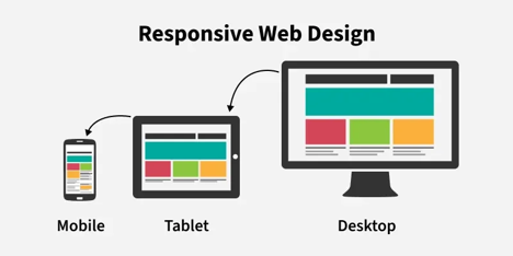
Responsive web design is a concept that helps a website to adapt its layout, pictures, and texts depending on the size of the screen and the device on which it is used. Instead of creating individual mobile and desktop sites, a single responsive site can ensure that all the platforms are the same.
● Automatically adjusts to the screen size
● Improves navigation and readability
● Works with flexible grids and layouts
● Optimizes pictures and media
● Improves user experience on devices
Why Responsive Design Matters in New York
New York is one of the most digitally competitive markets in the world. Whether you're a startup or an established brand, partnering with an experienced Freelance Web Designer New York can make all the difference. Customers expect speed, convenience, and accessibility. If your site fails to deliver, they’ll simply move to a competitor.
Mobile Usage Is Dominating
More than half of all website traffic comes from mobile devices. For NYC businesses, this number is even higher due to on-the-go users.
A mobile-friendly website NYC isn’t optional anymore—it’s essential. People search for restaurants, services, and stores while walking down the street. If your site isn’t optimized for mobile, you’re missing out on real-time customers.
First Impressions Happen Fast
Users form an opinion about your website in less than 3 seconds. If your site:
● Loads slowly
● Looks broken on mobile
● Has hard-to-read text
They’ll leave immediately.
Responsive design ensures your website always looks polished and professional, no matter the device.
SEO Benefits and Google Rankings
Search engines like Google prioritize mobile-friendly websites. If your site isn’t responsive, your rankings can suffer.
Using Responsive Design for Small Business websites helps:
● Improve search rankings
● Reduce bounce rate
● Increase time spent on the site
Google uses mobile-first indexing, meaning it primarily evaluates the mobile version of your website.
Key Features of Responsive Web Design
To truly understand what is responsive web design, it helps to look at its core components.
Flexible Grid Layouts: Content is arranged in proportion-based grids instead of fixed pixels, allowing elements to resize smoothly.
Responsive Images: Images automatically scale and adjust without losing quality or breaking layouts.
Media Queries: CSS rules detect screen size and apply appropriate styling for different devices.
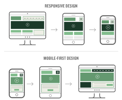
Mobile-First Approach: Design starts with smaller screens and scales up, ensuring the best mobile experience first.
Benefits for New York Businesses
Improved User Experience
User experience is everything. A responsive website ensures:
● Easy navigation
● Readable text
● Fast loading times
Customers stay longer and engage more.
Higher Conversion Rates
When users can easily browse and interact with your site, they are more likely to:
● Make purchases
● Book services
● Contact your business
A mobile-friendly website in NYC directly impacts your bottom line.
Cost Efficiency
Instead of maintaining separate desktop and mobile websites, responsive design combines everything into one system.
For businesses focusing on responsive design for small businesses, this means:
● Lower development costs
● Easier maintenance
● Faster updates
Competitive Advantage
In NYC, competition is fierce. A responsive website gives you an edge over businesses still using outdated designs.
If your competitors offer a better mobile experience, customers will choose them over you.
Common Mistakes Businesses Make
Even though many businesses understand what is responsive web design, they often implement it incorrectly.
Ignoring Mobile Optimization: Some websites claim to be responsive but still perform poorly on mobile.
Slow Loading Speeds: Heavy images and poor coding can slow down your site, especially on mobile networks.
Poor Navigation: Menus that are hard to tap or confusing layouts can frustrate users.
Not Testing Across Devices: Your website should be tested on multiple screen sizes and browsers.
Industries in NYC That Benefit the Most
While every business needs responsive design, some industries rely on it even more.
Restaurants and Cafes: Customers often search menus and directions on their phones.
Law Firms: Clients look for quick information and contact options.
Real Estate: Buyers browse listings on mobile devices.
Retail Stores: Online shopping must be smooth across all devices.
A mobile-friendly website NYC is essential in all these sectors.
Responsive Design vs Mobile-Friendly Design
Many people confuse these two terms.
Mobile-Friendly Design
● Works on mobile devices
● May not adapt perfectly to all screen sizes
Responsive Design
● Fully adapts to any device
● Offers a consistent experience everywhere
So, when asking what is responsive web design, think of it as the more advanced and complete solution.
How to Know If Your Website Is Responsive
You can quickly check if your site is responsive by:
● Resizing your browser window
● Opening your site on different devices
● Using online testing tools
If your layout breaks or becomes hard to use, it’s time for an upgrade.
Steps to Make Your Website Responsive
If your current site isn’t optimized, here’s what you can do:
Use a Responsive Framework: Frameworks like Bootstrap or Tailwind help build adaptable layouts.
Optimize Images: Use compressed and scalable images for faster loading.
Improve Page Speed: Minimize code and use caching techniques.
Focus on Mobile UX: Design for smaller screens first.
Test Regularly: Ensure your site works across devices and browsers.
For businesses adopting responsive design for small businesses, these steps are essential for long-term success.
The Role of Responsive Design in Branding
Your website represents your brand. A poorly designed site can damage your reputation.
Responsive design helps:
● Build trust
● Maintain consistency
● Improve credibility
In a city like New York, where customers have endless choices, perception matters.
Future Trends in Responsive Web Design
The concept of responsive web design continues to evolve.
AI-Powered Personalization: Websites will adapt not just to devices but also to user behavior.
Voice Search Optimization: Designs will accommodate voice-based interactions.
Advanced Animations: Smooth transitions and micro-interactions will enhance user experience.
Foldable Devices: Websites will adapt to new screen types and sizes.
Why Your NYC Business Can’t Ignore It
If your website isn’t responsive in 2026, you’re already behind.
A mobile-friendly website in NYC is no longer a luxury—it’s a necessity. Customers expect fast, smooth, and intuitive experiences. If you fail to meet those expectations, they won’t hesitate to move on.
Investing in responsive design for small businesses ensures your website:
● Attracts more visitors
● Keeps users engaged
● Converts leads into customers
When Should You Upgrade to Responsive Design?
If your website isn’t delivering results, it may be time for an upgrade.
● High bounce rates
● Poor mobile performance
● Outdated design
● Low conversions
● Negative user feedback
How Saad Web Designer NYC Can Help
If you’re looking to implement responsive design for small business, working with an experienced freelancer makes a big difference. At Saad Web Designer NYC, we focus on creating websites that are fast, responsive, and conversion-driven.
● Custom responsive website design
● Mobile optimization for all devices
● SEO-friendly development
● Affordable solutions for startups
● Ongoing support and updates
Conclusion
The responsive web design is no longer a luxury, but rather a key element in operating a successful business over the internet. Knowing what constitutes responsive web design will make you understand why it has a direct influence on user experience, SEO, and conversions. A competitive market, such as New York, requires a mobile-friendly site that will enable customers to trust the site NYC customers can trust and therefore grow.
Whether you are a startup or an established business, by investing in responsive design for small businesses, you will ensure that your website will work across all devices and will be able to meet the expectations of the modern user. When you are not getting the desired results with your current site, it is time to upgrade. The right strategy and the professional assistance of experts (Saad Web Designer NYC) can help you to create a website that will not only look great, but also make the real business a success. So, get in touch with him today!
FAQ's
What is responsive web design?
+Why is a mobile-friendly website important in NYC?
+Is responsive design necessary for small businesses?
+Does responsive design improve SEO?
+How can I check if my website is responsive?
+


Leave a Reply