

© 2026 Saad Web Designer | All Rights Reserved


Brooklyn, NYC
NYC Business Website Accessibility Testing Checklist
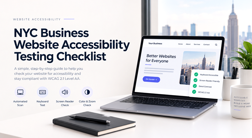
A website accessibility check for an NYC business consists of 4 stages: a computer automated test, a keyboard traversal test, a screen reader check and a manual assessment of color contrast, magnification, and forms in accordance to WCAG 2.1 Level AA. Passing the four tests ensures that you pass your site is accessible and provides you with suggestions on what you can do next to improve your site's accessibility. The checklist below is for website owners and managers who want to check their sites themselves prior to spending thousands of dollars on an external accessibility audit. The checklist items are ordered according to the approximate amount of time it will take you to complete them, and begin with the most straight forward and most useful tests.
There is a reason why New York leads the country in website accessibility lawsuits. Seyfarth Shaw LLP reports that New York federal courts received 1,021 website accessibility lawsuits in 2025, making it the busiest state by a significant margin and it reports that plaintiffs have been shifting toward state court, where New York's own human rights laws apply. A restaurant, a law firm, a clinic, and a Shopify store in Brooklyn are all fair game.
The checklist below is intended for website owners and marketing managers who wish to test their site themselves or have a general understanding of what an accessibility audit entails. The checklist is ordered in terms of descending value and time needed to complete.
What "ADA website testing" means in practice
The ADA does not prescribe a specific technical standard for websites of private businesses. In practice, however, Web Content Accessibility Guidelines (WCAG) 2.1 Level AA are considered an industry standard because they are explicitly referenced in the DOJ’s website accessibility guidelines. While WCAG 2.2 was released in June 2023, it is better to request a WCAG 2.2 Level AA conformance audit since the standard has more specific requirements, including larger touch targets.
Two things worth knowing. First, New York State and New York City human rights laws exist alongside the ADA, so "we are not covered by the federal law" is not a safe assumption. Second, nothing here is legal advice: if you have received a demand letter, talk to an attorney before you do anything else. For the broader legal picture, see our guide to ADA website compliance
Set your scope before you test
You do not need to test every page. Test each template and each important journey instead:
● Homepage and main navigation, including dropdown menus
● Your contact, booking, or quote form from first click to confirmation
● Checkout and payment, if you sell anything
● One typical content page (a service page, a blog post, a menu)
● Any PDF a customer has to open, such as a menu, intake form, or price list
● Third-party pieces: chat widgets, booking tools, embedded maps, cookie banners
Test on a desktop browser and on a real phone. Many failures only appear on one of them.
The accessibility QA checklist
1. Run an automated scan
Begin by using a free accessibility checker such as the axe DevTools extension, WAVE or Lighthouse (Chrome). The scan will only take about ten minutes per template and will alert you to missing form labels, low conBegin by running a free accessibility scan using the axe DevTools bookmarklet, WAVE or Lighthouse (Chrome). The scan will only take around ten minutes per template, and will advise you on unlabeled form fields, low contrast, empty links, and out-of-order headings. trast, empty links, and incorrectly ordered headings.
Think of these scans as a baseline, rather than an end result. Automated tools can only do so much, and although they will undoubtedly flag a number of issues, a passing score shouldn’t be considered one. In reality these tools can only do a fraction of the work required, and no algorithm can identify the difference between good and bad alt text, or determine whether your menu will make sense to someone using a keyboard.
2. Test with the keyboard only
Put the mouse aside and use Tab, Shift+Tab, Enter, Space, Esc, and the arrow keys. Check that:
● Every link, button, and form field can be reached and used
● The tab order follows the visual order
● A "skip to main content" link appears on the first Tab press
● You can always see where focus is (a clear outline or highlight)
● You can get out of everything you get into. Pop-ups, chat windows, and menus are the usual keyboard traps
● Esc closes a modal and returns focus to the button that opened it
If a sticky header or cookie banner covers the element you are focused on, note it. WCAG 2.2 specifically calls this out.
3. Do a screen reader pass
Use VoiceOver on a Mac or iPhone (built in), NVDA on Windows (free), or TalkBack on Android. You do not need to become an expert user. Spend fifteen minutes on your homepage and one form and listen for:
● A page title that says what the page is
● Headings that make sense when you jump through them
● Links that read clearly out of context. "Click here" and "Learn more" repeated ten times do not
● Buttons and icons with real names, not "button" or silence
● Form fields announced with their labels, and errors announced when they appear
● Images described when they carry information, and skipped when they are decoration
4. Check color, zoom, and text size
Contrast: normal text needs at least 4.5:1 against its background, large text 3:1. Input borders and icons that carry meaning need 3:1. Light gray text on white is the classic miss
lor alone: Co errors, required fields, and links should not rely on color to be understood
Zoom: at 200% browser zoom nothing should be cut off, and at 400% (about 320 pixels wide) the page should reflow into one column without sideways scrolling
Text spacing: increasing line and letter spacing should not hide or overlap content
5. Test every form
Forms are places where an inaccessible site costs you customers directly. Make sure that each field has a visible label (a placeholder disappears as soon as somebody starts typing), required fields are indicated in text, and error messages indicate what went wrong and are placed near the field. Name, email, and address fields should be populated by browsers’ autofill, and the form itself should be possible to fill out and submit without using a mouse.
6. Review images, video, and audio
Alt text should describe what the image depicts on the page, not just what it shows: “menu for the Brooklyn location, PDF” is better than “menu.” Images that are purely decorative should have empty alt text. Videos should have captions, and videos with audio should have a transcript or an equivalent. Nothing should autoplay with sound, and carousels should have a pause button.
7. Check structure and page basics
Each page should have one H1, and headings should follow a hierarchy, have a descriptive title and the language of the page specified in the code. Tables must have header cells. Landmarks (typically a header, navigation, main, and footer region) enable screen reader users to navigate your site more efficiently and are typically present in most modern themes, but always double-check.
8. Test on mobile and touch
The pinch-zoom should not be disabled on your site, it should function properly in portrait and landscape orientation, and buttons and links should be large enough and spaced out enough to allow for easy tapping with a finger. WCAG 2.2 specifies a minimum target size of 24 by 24 CSS pixels. Any interface or functionality which requires a swipe or drag to operate should have an alternative way of operating.
9. Check PDFs and third-party tools
A scanned-in menu saved as an image within a PDF is not going to be accessible to a screen reader. Either give the information on a standard web page or produce the document as a tagged PDF. Embedded booking, chat or payment widgets count as part of your website so ask the supplier for an accessibility conformance report (sometimes referred to as a VPAT or ACR), but always try the widget out for yourself too.
Free tools worth using
| Tool | What it checks | Cost |
|---|---|---|
| axe DevTools (browser extension) | Automated WCAG issues, with fix suggestions | Free version available |
| WAVE (WebAIM) | Visual overlay of errors, headings, and landmarks | Free extension |
| Lighthouse (built into Chrome) | Quick accessibility score plus a list of failures | Free |
| WebAIM Contrast Checker | Text and UI color contrast ratios | Free |
| NVDA | Screen reader testing on Windows | Free |
| VoiceOver | Screen reader testing on Mac and iPhone | Built in |
Pricing and features change, so check each tool's site before you rely on it.
Where NYC business sites tend to fail
WebAIM's annual analysis of one million homepages keeps finding the same short list of problems: low-contrast text, missing alt text, missing form labels, empty links, empty buttons, and a missing page language ( WebAIM Million). Those are the first things to look for. Beyond them, the trouble spots depend on what kind of business you run:
| Business type | Test this first | Why it breaks |
|---|---|---|
| Restaurants and cafes | Menu, reservation widget | Menus are often image-only PDFs, and booking embeds come from a third party. |
| Law firms and professional services | Contact form, attorney or team pages | Light gray text, unlabeled form fields, and headshots with no alt text. |
| Medical and wellness | Appointment and intake forms | Long forms with unclear errors, and PDF intake packets. |
| Retail and e-commerce | Product filters, cart, checkout | Filters that only work with a mouse, and unlabeled quantity and payment fields. |
| Real estate | Listing galleries, maps, search | Sliders without keyboard controls, and map-only information. |
Document what you find
A test you cannot reproduce is not much use. Keep a simple log with one row per issue:
| Page | Issue | WCAG criterion | Severity | Fix owner | Status |
|---|---|---|---|---|---|
| Contact | Email field has placeholder but no label | 3.3.2 Labels or Instructions | High: blocks form completion | Developer | Open |
Rank by what stops a person from finishing a task. A missing label on your checkout form comes before a slightly low-contrast footer link. After fixes go live, retest the same pages the same way, and put a date on it.
If you publish an accessibility statement, keep it honest. Say which standard you test against, when you last tested, and how someone can reach a human if they hit a problem. Do not claim full compliance unless an audit supports it.
When to bring in help
The above-mentioned checks will give a decent result. A professional audit is reasonable if you sell something online, need to implement some custom functionality (calculators or booking systems, for example), have received a demand letter, or plan to redesign the system anyway. In addition, ask the contractor to perform an audit that includes testing all the pages’ templates manually (not automatically) and providing precise instructions for fixing the errors found.
It is worth avoiding the “accessibility plugin,” whether it is called overlay or another name, as these tools are often criticized by specialists for only masking the problem on the website’s surface without fixing real code.
An accessibility plugin is not a solution because it runs on top of your code and is unable to fix the underlying issues addressed by the axe tests.If the fixes live in your theme or custom code, a Web Designer New York who builds with accessibility in mind can fold the repairs into the site itself, so they stay fixed when you update content.
Mistakes to avoid
● Testing only the homepage
● Treating a green scan score as proof of accessibility
● Testing once and never again. Every new page, plugin, or redesign can reintroduce problems
● Assuming your vendor's widget is accessible without checking
● Fixing the easy cosmetic items first and leaving the form or checkout broken
Conclusion
Start small this week: run the scan, tab through your homepage and contact form, and listen to one page with a screen reader. Write down what isn’t working, fix the issues that prevent people from contacting you, booking, or buying first, and retest.
If you'd rather let us do the testing and repairs, we can audit your website against the WCAG 2.1 AA standard and fix the issues we find. Just contact us, and we’ll show you what our tests reveal so you know what to expect from a professional accessibility repair.
FAQ's
Does a small NYC business website need to be accessible?
+Is WCAG legally required for my business website?
+How long does an accessibility test take for a DIY audit?
+When should I do an accessibility test?
+